
Oh, Roboto, you modern classic. For me, Roboto evokes feelings of trust and ease. I doubt I need to explain Roboto, but in case you’ve been living under a design-rock, this font was released in 2013, is the official font of Material Design (and most every Google product).
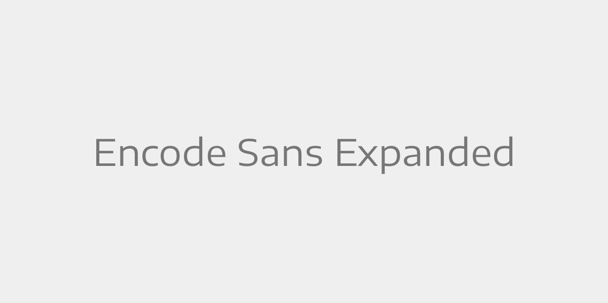
This is a new one for me. Encode Sans gives me vibes of precision and structure. It has a large variety of weights and widths. Included are Tabular and Old Style figures, as well as full set of Small Caps and other Open Type features.
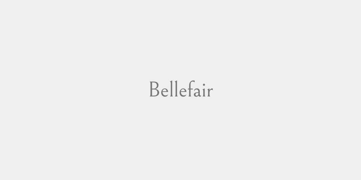
Yes! Yes! I love this one. The elegance of Bellefair oozes at it’s small serifs. Because of it’s variation in strokes, it might be a bit hard to read for smaller body copy, but is perfect for headlines.
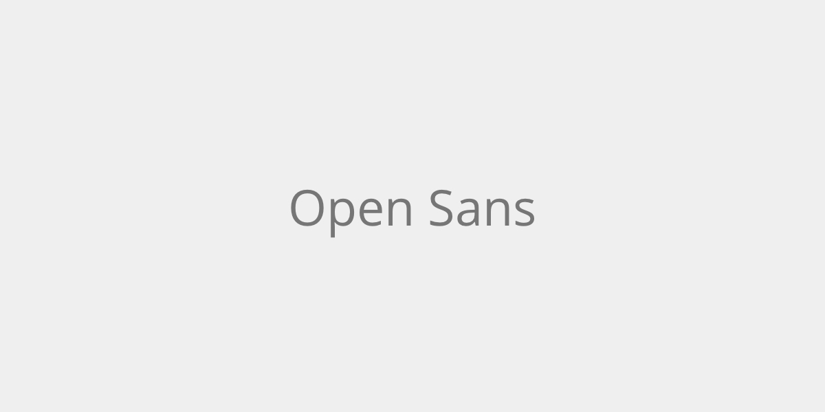
Another classic sans serif, that never gets old. Super easy to read, very neutral for any project. It has lots of variety in weights and widths.
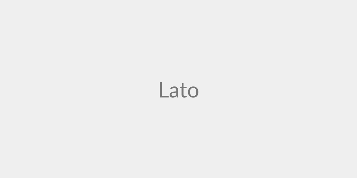
Lato has been popular on the type scene for years. It gives me the vibes of friendliness and delicateness. I love the way it looks in it’s italic style, so effortless.
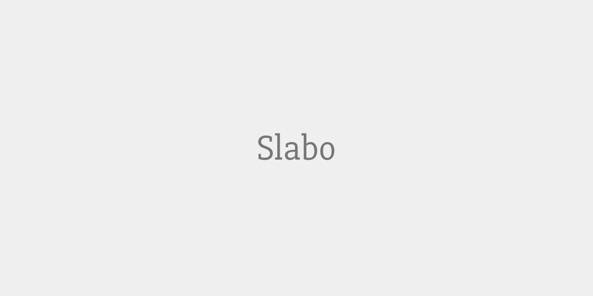
This font is a newbie. It gives me a whimsical feel, and would work great in body and headlines.